Sunday, May 8, 2011

Gimme Gimme Gimme

Everyone loves a good freebie, which is why trying to come up with promo stuff for the brand has been such a hard task, especially considering the brand I have developed has a variety of components to it...

Initially there was a large variety of aspects running through my head including garters for the lingerie, over sized wedding prints of photography and all other manner of wedding novelty in between. To try and make it easier on myself I thought the promo item could be some form of goodie bag if you will... it just needed a theme to tie it together, which then caused that little light bulb to go off, Honeymoons. They are a huge part of the wedding aspect, so to create a little something something for the honeymoon I thought would be an ideal promo product.

Next problem would be what exactly to put in this little kit, as when I think of honeymoons I immediately think of wines, chocolates and flowers and all the stuff on the frisky side like massage oils, chocolate body paints and everything else in between for the newly weds nights of fun. I've narrowed it down to a honeymoon album in which they can fill that with all the memories from there honeymoon, as well as a 20% off gift voucher for lingerie, as we all know thats an essential for any honeymoon... I was thinking of possibly putting in a small pack of massage oils/body paint but I think that could be seen as inappropriate for a label to be giving out, also it depends on the couple on whether something like this would be used... probably an item in which the couple wanted it they could buy it themselves to spice up there sex life.

anywho off to ponder the eerie screams coming from the beach... over and out

Saturday, May 7, 2011

Here a box, there a box, everywhere a box

*insert overly done Italian accent* Isn't it soooo pretty

ah garment packaging.... due to the nature of wedding dresses I immediately thought of a very elegant box which would house the dress and lingerie... cause lets admit it everyone loves to open up a big box makes us feel special. Boxes are also more fitting for wedding garments as opposed to a bag, bags not only look but feel cheap... definitely not the feel I want to achieve...

The box that I will be using for the garment packaging will be similar to the one seen above ^^ As I have already incorporated the branding of stripes I want to use that with the box design, however I will then have the logo on the top. The inside of the box will be presented with black and purple tissue paper (or something just as delicate and unharmful to the garments) Presentation is Vital

I dub thee the logo

so many countless possibilities... in the grand scheme of things I wanted the logo to be elegant, simple and sophisticated. Initially I was going to incorporate a font based logo from the font I had chosen, however the font itself was a little over whelming as a logo, even when incorporated with an image; which made it look to open, there was no structure. I settled for a more simpler font, however I chose a intricate design to frame the image. I also wanted a bi-line as I believe that its a nice way of informing the audience of what this brand entails as the name doesn't really elude to the nature of the brand.

in the big bad world of logo's I've narrowed it down to the following two choices.... the top choice I think works quiet well, the way it is framed so it works well at any size as the shape is still identifiable... the second choice is a nice logo however as it isn't squared off its a little too open on the ends and this can create problems when it comes to sizing...

overall I am leaning towards the top logo as it is a nice shape, frame and is elegant encapsulating the essence of the brand.... anywho off to run away from the blah blah blah's with Charlie the Unicorn... over and out

Thursday, March 31, 2011

Fonts, glorious fonts


Fonts glorious fonts.... we're eager to pick one
so I have narrowed it down to these two fonts.... I was generally aiming for a script type font that was a bit scrawled and different t the typical nice and fancy neat ones...
I think Ima leaning more towards the top font as it still has these above elements whilst looking rather snazzy ^^ the bottom font, although very nice kinda gets a tad out of control and is very overwhelming....
anywho off for more sleep deprivation... third blog entry over and out

Wednesday, March 30, 2011

Color Scheme

the color scheme I was looking at was a black with either a purple or a turquoise/aqua... I've narrowed it down to the purple in the top row in the right hand corner or the aqua third row first square. However I think through just personal preference that I like the purple easily alot more than any other scheme, it has more of a darker look why still maintaining the whole "romantic" thing... lol....
my main issue is will that purple be light enough in the grand scheme of things or will it need to possibly be the first purple in the first row >.<
anywho off to continue with my quest for world domination... second blog entry over and out

the sleep deprived ramblings about lingerie clad models

the week is drawing to a close and yet again ima leaving everything to the last minute... like this wonderful blog...
what to say, the weekly process hasn't really been started however the general jest of my brand/logo thingamajig is bridal wear (cause even if I hate the notion of weddings and all the crap that goes along with it I still think the dresses are pretty), lingerie (cause that always makes me happy ^^) and photography....
all 3 aspects tie together well as a cohesive kind of unit if you will... and I will be wanting the title of my bran being BeautifullyRepulsive.... something I have kind of already established with myself... it might seem that it has a bit of a negative connotation to it, but the truth behind it is i thing that all aspects of life that are beautiful have a repulsive aspect to it, kind of a yin yang thing lol.... and if we look at this in regards to marriage, it might be this wonderful thing.... but seriously your stuck with that person for life ^^ enough of a negative there lol...
sooo in general the basis has been decided, have just been spending my time looking at lingerie clad models (tough life i know) and bridal gowns (why is pictures never of a good resolution... making my life more difficult)
okies enough with my sleep deprived ramblings... first blog entry over and out

Sunday, August 2, 2009

Templatey goodness n the epicness of dots

the technique used to create these templates was with the pen tool in illustrator....... lotsa dots are used to plot which then link together to create the image....... n you can even create curvy lines by holding down on the mouse and swinging it in the direction of your choosing.... just make sure the handle is angled in the direction of the line as it can distort it..... also seeing as an outline was being created ensure that the fill is turned off aka theres a big red line through the little color squares... otherwise like me you'll be wonder what the heck happened to the rest of your image that your tracing around with your awesome skills with the mouse ^^


the man template


the woman template

Tuesday, May 19, 2009

i found an angry pannnnddda


yush i was looky n found a panda ^^
he was angry >>

Tuesday, May 12, 2009

concept boards in all there goodness ^^

sooo for the decision of concept boards ima still a tad undecided.......


everyone thinks i should use my template.. not exactly my personal fav but ima sure it will do the job....


this is where my dilemma is the template works n all.... but the collage has alot of good imagery (which kylie and i both found with the designs).... n when starting to work on designs last night i found i was drawing alot of inspiration for the collage..... n technically isnt that the point of the concept board?? to look back at it for ideas.... sooooo atm ima drifting towards the collage as the main concept board..... however i might change my mind to the template... not quiet sure yet =/


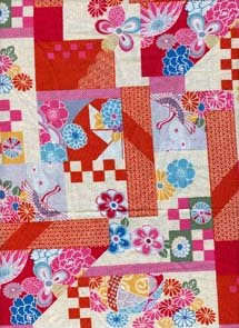
this is the collage concept board.....

the template.....

Tuesday, March 31, 2009

Movie Goodness ^^

soooo having a looky at all the different fonts for movies posters you realize there is alot of crap out there >>

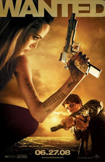
an example of this crappy font is the WANTED movie poster... the graphics for this poster are good but the font really lets it down..... granted the title stands out due to the big bulky size but its very plain and boring... this movie is pretty face paced filled with lots of action yet this font really doesnt portray that as the graphic can hint at.... it also doesnt stand out as well as it could due to the color scheme... i think it blends in to well with the rest of the poster.... the only thing i can gather for the font being like this is due to the old school wanted posters.... it has a similar formatting but i dont think it does this movie poster justice.....


an example of a font that works really well for the movie poster (yush there are some good ones out there ^^) is CHARLIE AND THE CHOCOLATE FACTORY......The combination of the graphics and the font of this poster creates a sense of whimsical adventure..... the movie opens up a world of the imaginary and this poster conveys it well... using bold but curvy childlike font adds to the message of what the movie is about... the color is also used well with the colorful and vibrant colors that help to create the fairytale world which is the chocolate factory... all n all the colors and font n graphics work really well to create this movie poster....


Wednesday, March 25, 2009

The Wonders of Scanning

Wow now to explore the epicness that is scanning ^^

A total overview of how to like scan using photoshop......


  1. put the said image/fabric or whatever your wittle heart desires to scan onto the scanner
  2. open the program photoshop
  3. clicked the menu "'file"' then scroll down to clicked on '"import'" and click on '"HP Scan Pro"'
  4. after the "'HP Scan Pro"' window comes up, click on '"adjust'" and make the scan to your needs eg, resolution, color mode etc then click '"new scan'"
  5. a preview of the said scan should appear from here you can adjust to what you want to scan by dragging the edges
  6. click the '"accept"' after of course you have the scan to your liking... the scanned images shall appear for you to continue making wonders ^^

Moire Patterns

  • when scaning some images from magazines, newspapers, fabrics and other stuff and fluff, undesried and unintentional changes to the quality of the image and color may occur (aka moire patterns) if this is to occur you can use the descreen button which will remove this imperfections to your images....

Resolutions

300 dpi is the best resolution for commerical printing..... brings up all the details and creates an extremely clear pikature.....

150 dpi is best for laser and inkjet printers...... not as of such a high quality like the 300dpi but still good


72 dpi is for email attachments or presentations, eg powerpoint etc... this image is of the lowest quality and you lose alot of the details....

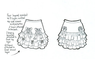
now for one more treat for you all seeing as ima soooo nice... dds of one of the skirts i did ^^