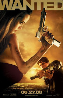
an example of this crappy font is the WANTED movie poster... the graphics for this poster are good but the font really lets it down..... granted the title stands out due to the big bulky size but its very plain and boring... this movie is pretty face paced filled with lots of action yet this font really doesnt portray that as the graphic can hint at.... it also doesnt stand out as well as it could due to the color scheme... i think it blends in to well with the rest of the poster.... the only thing i can gather for the font being like this is due to the old school wanted posters.... it has a similar formatting but i dont think it does this movie poster justice.....

an example of a font that works really well for the movie poster (yush there are some good ones out there ^^) is CHARLIE AND THE CHOCOLATE FACTORY......The combination of the graphics and the font of this poster creates a sense of whimsical adventure..... the movie opens up a world of the imaginary and this poster conveys it well... using bold but curvy childlike font adds to the message of what the movie is about... the color is also used well with the colorful and vibrant colors that help to create the fairytale world which is the chocolate factory... all n all the colors and font n graphics work really well to create this movie poster....


No comments:
Post a Comment