Sunday, August 2, 2009

Templatey goodness n the epicness of dots

the technique used to create these templates was with the pen tool in illustrator....... lotsa dots are used to plot which then link together to create the image....... n you can even create curvy lines by holding down on the mouse and swinging it in the direction of your choosing.... just make sure the handle is angled in the direction of the line as it can distort it..... also seeing as an outline was being created ensure that the fill is turned off aka theres a big red line through the little color squares... otherwise like me you'll be wonder what the heck happened to the rest of your image that your tracing around with your awesome skills with the mouse ^^


the man template


the woman template

Tuesday, May 19, 2009

i found an angry pannnnddda


yush i was looky n found a panda ^^
he was angry >>

Tuesday, May 12, 2009

concept boards in all there goodness ^^

sooo for the decision of concept boards ima still a tad undecided.......


everyone thinks i should use my template.. not exactly my personal fav but ima sure it will do the job....


this is where my dilemma is the template works n all.... but the collage has alot of good imagery (which kylie and i both found with the designs).... n when starting to work on designs last night i found i was drawing alot of inspiration for the collage..... n technically isnt that the point of the concept board?? to look back at it for ideas.... sooooo atm ima drifting towards the collage as the main concept board..... however i might change my mind to the template... not quiet sure yet =/


this is the collage concept board.....

the template.....

Tuesday, March 31, 2009

Movie Goodness ^^

soooo having a looky at all the different fonts for movies posters you realize there is alot of crap out there >>

an example of this crappy font is the WANTED movie poster... the graphics for this poster are good but the font really lets it down..... granted the title stands out due to the big bulky size but its very plain and boring... this movie is pretty face paced filled with lots of action yet this font really doesnt portray that as the graphic can hint at.... it also doesnt stand out as well as it could due to the color scheme... i think it blends in to well with the rest of the poster.... the only thing i can gather for the font being like this is due to the old school wanted posters.... it has a similar formatting but i dont think it does this movie poster justice.....


an example of a font that works really well for the movie poster (yush there are some good ones out there ^^) is CHARLIE AND THE CHOCOLATE FACTORY......The combination of the graphics and the font of this poster creates a sense of whimsical adventure..... the movie opens up a world of the imaginary and this poster conveys it well... using bold but curvy childlike font adds to the message of what the movie is about... the color is also used well with the colorful and vibrant colors that help to create the fairytale world which is the chocolate factory... all n all the colors and font n graphics work really well to create this movie poster....


Wednesday, March 25, 2009

The Wonders of Scanning

Wow now to explore the epicness that is scanning ^^

A total overview of how to like scan using photoshop......


  1. put the said image/fabric or whatever your wittle heart desires to scan onto the scanner
  2. open the program photoshop
  3. clicked the menu "'file"' then scroll down to clicked on '"import'" and click on '"HP Scan Pro"'
  4. after the "'HP Scan Pro"' window comes up, click on '"adjust'" and make the scan to your needs eg, resolution, color mode etc then click '"new scan'"
  5. a preview of the said scan should appear from here you can adjust to what you want to scan by dragging the edges
  6. click the '"accept"' after of course you have the scan to your liking... the scanned images shall appear for you to continue making wonders ^^

Moire Patterns

  • when scaning some images from magazines, newspapers, fabrics and other stuff and fluff, undesried and unintentional changes to the quality of the image and color may occur (aka moire patterns) if this is to occur you can use the descreen button which will remove this imperfections to your images....

Resolutions

300 dpi is the best resolution for commerical printing..... brings up all the details and creates an extremely clear pikature.....

150 dpi is best for laser and inkjet printers...... not as of such a high quality like the 300dpi but still good


72 dpi is for email attachments or presentations, eg powerpoint etc... this image is of the lowest quality and you lose alot of the details....

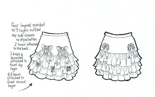
now for one more treat for you all seeing as ima soooo nice... dds of one of the skirts i did ^^